
Most liquor stores know what’s on the shelf. Far fewer can tell you what happened to it.
That’s the gap that costs money. A bottle showing 4 on hand when there are 2 in the aisle isn’t a counting problem, it’s a history problem — somewhere between the order, the delivery, the adjustment and the sale, something happened that nobody recorded. By the time you notice, the trail is cold.
mPower is a document-based system, which is a technical way of saying that every time an item is touched, it’s written down. Ordered, received, adjusted, transferred, sold. That’s what makes real liquor store inventory management possible rather than just inventory counting: you can go back and see what happened, not just what’s left.
Most of that lives in one place. Here’s how to read it.
The item screen is the whole record
Open any item and you get the identifiers first: UPC, SKU, department, size, case pack. Useful for setup, but the identifiers aren’t why you’re here. The tabs are.
Each tab answers a different question about the same bottle. Cost and margin. Promotions. Where it physically sits and how deep you’re stocked. And underneath, the two history tools that most owners never open and should.
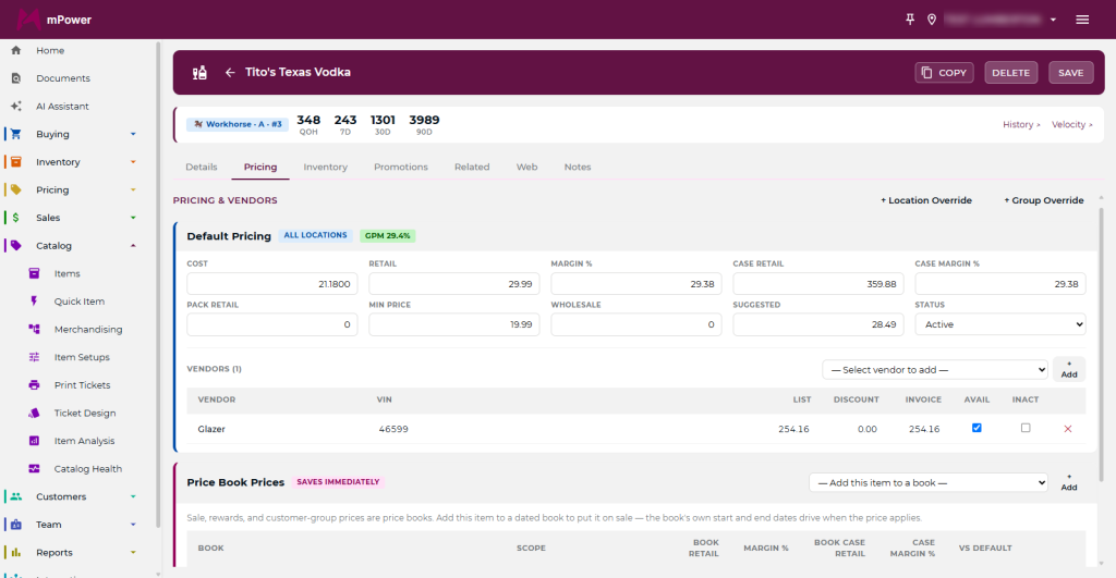
Vendor and pricing: what it costs you, right now
The vendor/pricing tab is where you change the vendor on an item and update pricing. The part worth your attention is on the right-hand side: gross profit margin and weighted average cost.
Weighted average cost is the number that keeps you honest. If you’ve received the same product at three different costs over six months, your margin isn’t based on the last invoice, it’s based on the blend of what’s actually sitting there. A store pricing off the most recent cost is guessing on every item that moved in price, which in this category is most of them.
Check this tab before you set a shelf price and before you commit to a promo. It takes ten seconds and it’s the difference between a promotion that builds traffic and one that quietly sells at a loss.
Promotions: every deal this item is in
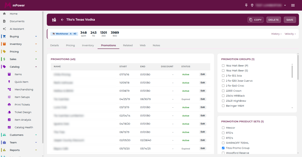
The promotions tab shows all the promos the item is attached to and the discount amount on each. If it belongs to a promotion group, that shows on the right-hand side.
This is the tab to open when a price rings wrong at the register. Nine times out of ten the item is sitting in a promotion group somebody set up months ago and forgot. You can add or remove the item from a promotion with the links in the bottom left corner, and print shelf tickets from the same place.
Inventory: on hand, min/max, and where it lives
The inventory tab shows how much you have on hand at each location, if you run more than one store. It’s also where you set minimums and maximums, and where you record the aisle and bin number.
Two things owners skip here that pay for themselves.
Set the min/max deliberately, not by feel. Your minimum should reflect how fast the item actually moves and how long your vendor takes to deliver. Use the sales velocity tool further down to get that number instead of guessing at it.
Fill in aisle and bin. It feels like busywork until a new employee is trying to find one SKU on a Friday night, or until you’re counting a section and want the count sheet to follow the physical store instead of the alphabet.
Item movement history: the part that solves problems
At the bottom left of the item detail tab there are two links most people never click. This is the first one.
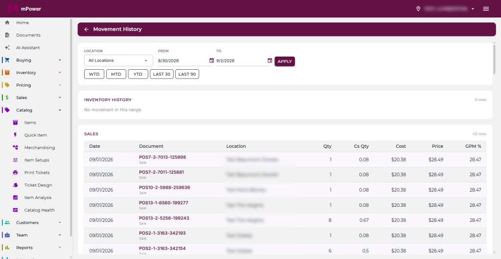
Item movement history lists every time the product was touched — ordered, received, adjusted, sold, transferred — in sequence. Click a document number and the actual transaction opens.
That’s the whole investigation. When a count is off, you don’t reconstruct the month from memory, you read the line where it went wrong and open the document behind it. Received 12 but the invoice said 24. An adjustment nobody can account for. A sale rung at the wrong price. Whatever happened, it’s on this list with a date and a document you can open.
Item sales velocity: how fast it actually moves
The second link is sales velocity, which shows the item’s sales history visually rather than as a table.
Use it for the two decisions that matter most on any given SKU:
- Reorder points. A visual trend tells you whether the item sells eight a week steadily or thirty in December and nothing in March. Those need very different minimums, and a flat reorder rule serves neither.
- Whether to keep carrying it. Slow movers are the quietest cost in the store. They don’t announce themselves, they just sit there holding cash. Velocity makes that visible in a way a shelf walk never will.
Pair it with what you’re seeing in reporting and you can work top down: reports tell you which categories and vendors deserve attention, the item screen tells you why.

Three habits worth building
The tools only pay off if somebody actually opens them. Three that are worth making routine:
- Before any promotion, check the vendor/pricing tab for weighted average cost. Confirm the discount still leaves margin.
- When a count is off by more than a bottle or two, go straight to movement history rather than recounting. The answer is usually in the last ten lines.
- Once a quarter, run velocity on your slowest department and cut or reduce the true dead weight. This is the single highest-return hour you’ll spend in the back office.
That’s inventory management built on a record of what happened, not a snapshot of what’s left.
If you want to see the item screen working against your own products, schedule a demo or call our sales team at (877) 396-0141.
Related reading: UPC vs. SKU: what’s the difference · Inventory management in mPower · Analytics and reporting